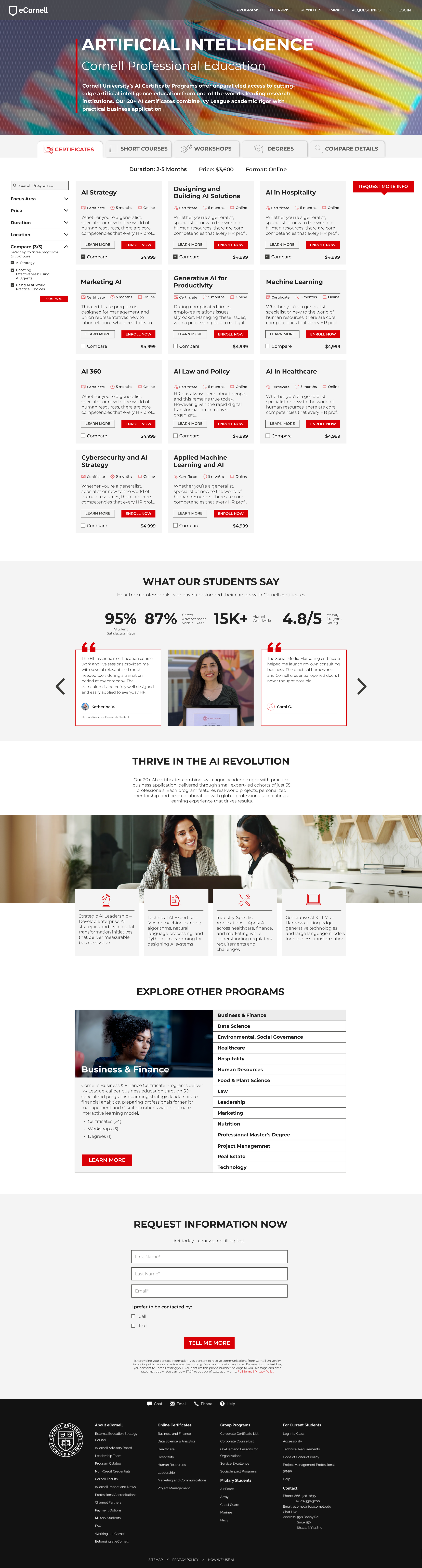
Web design
system
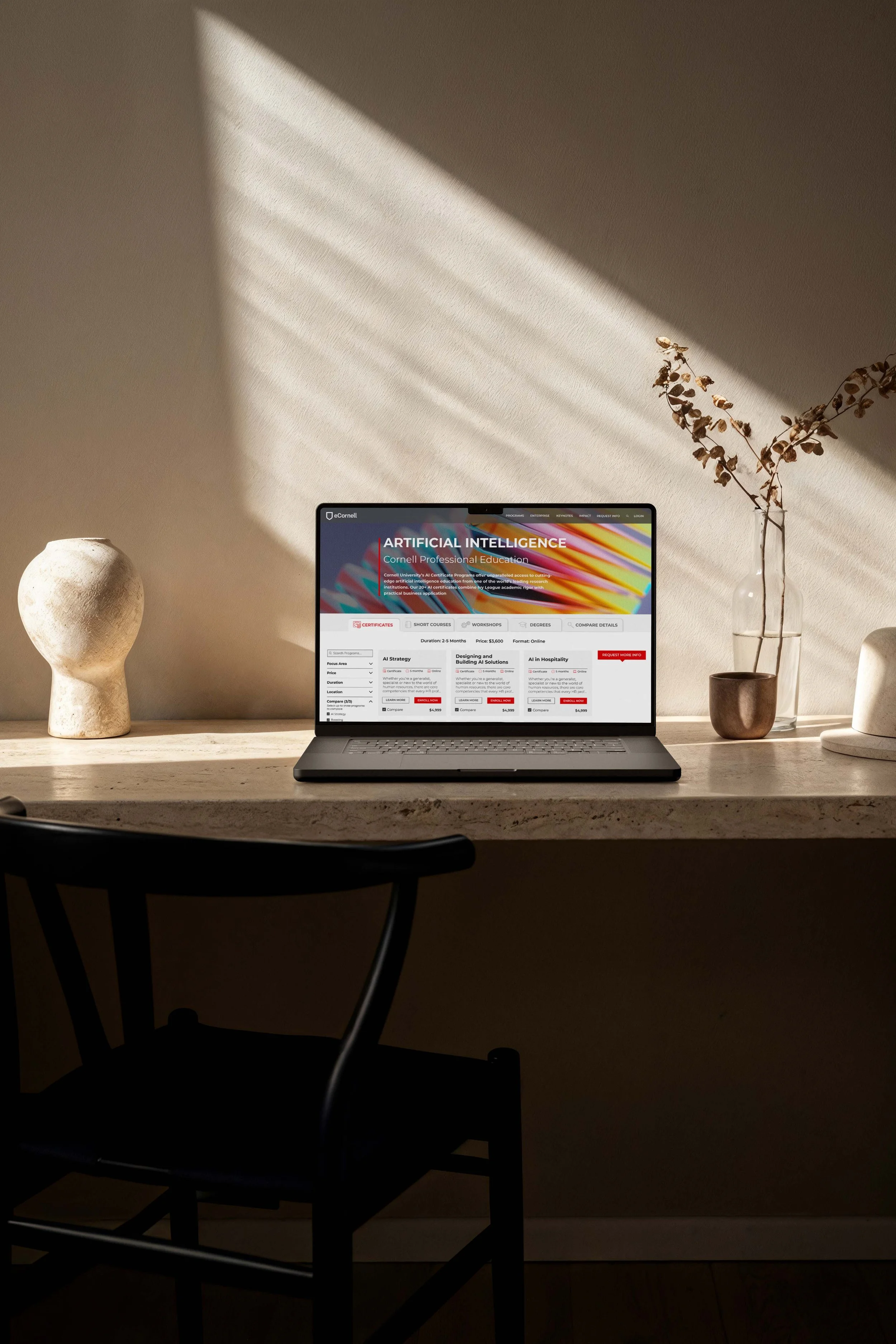
You landed on eCornell’s website and it feels outdated in both design and functionality.
I brought modern modular design components to the site, familiar UI that made it easy to interact with.
This was about understanding what eCornell offered - fast, succinct, and user friendly. This system became part of the web guide. It grew to become the template used for future page rebuilds across the site.
a site that finally feels current — modern, functional, and easy to navigate
the impact
how do we help the user choose between the different program offerings?
the main problem
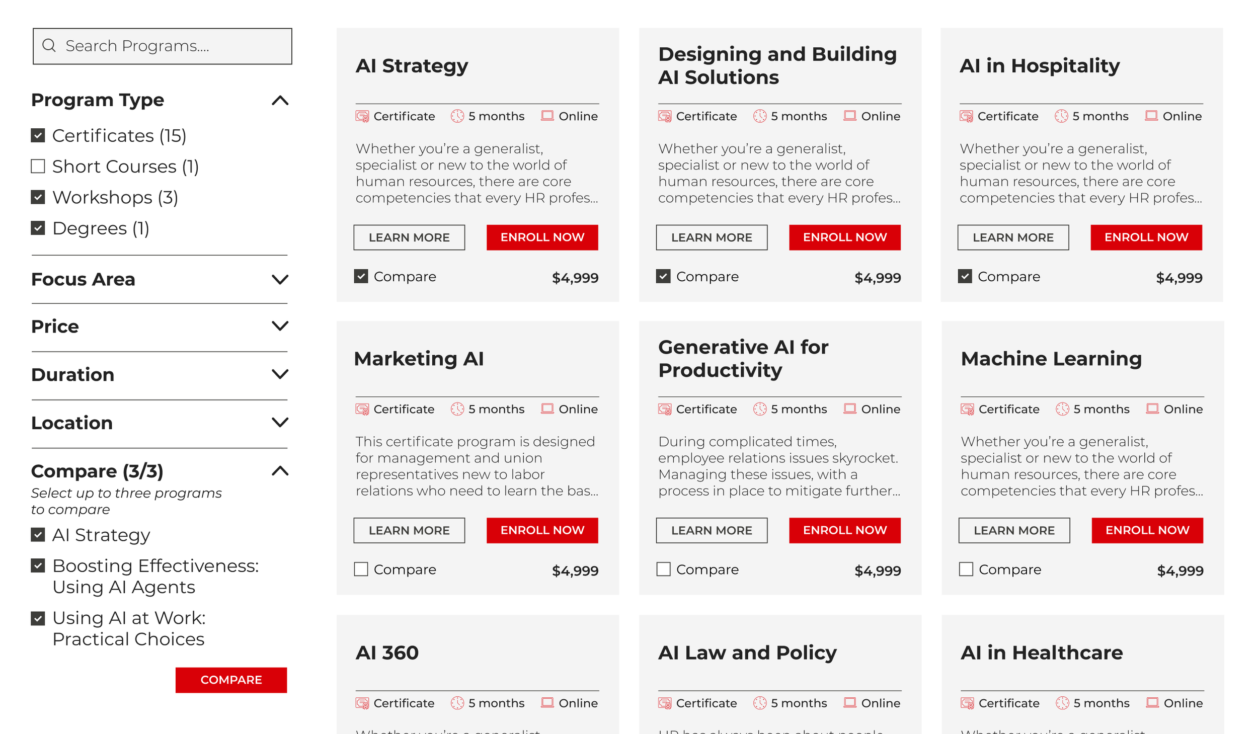
is a side filter the easiest?
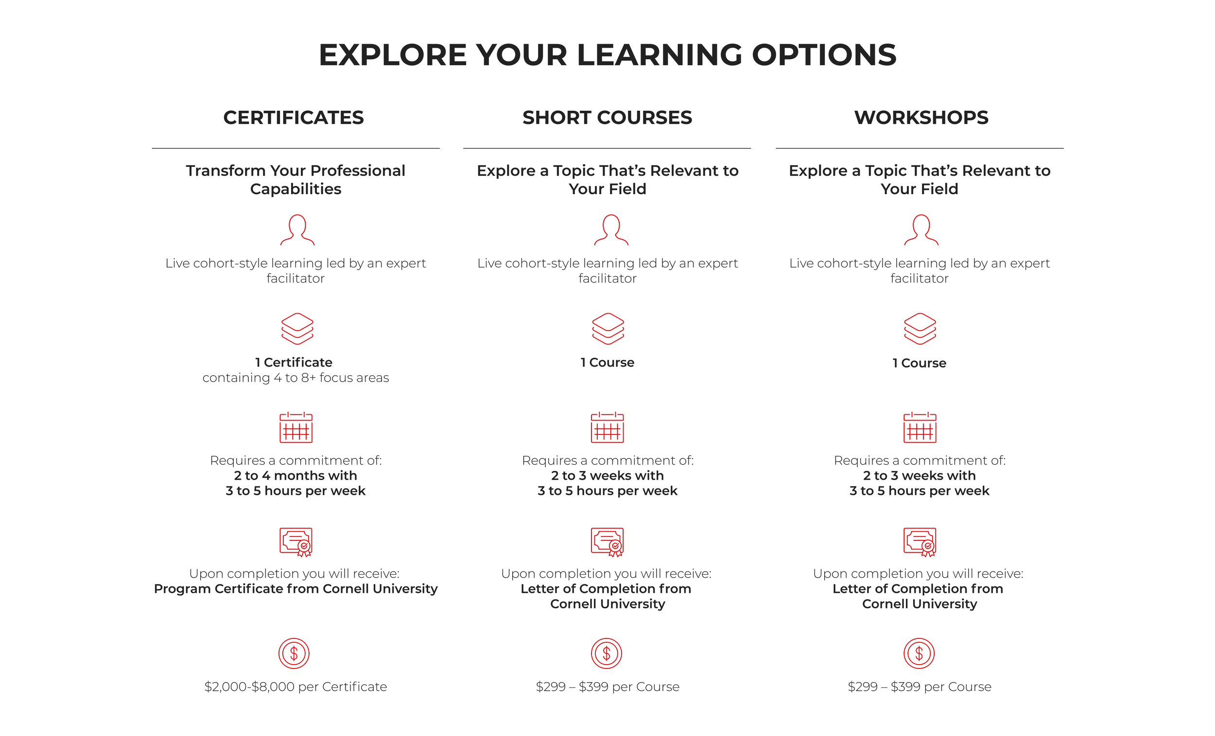
would a familiar comparison table work?
the reach
same system, different projects

my final product